Logistics
Logistics TMS redesign cuts load creation from 3 minutes to 30 seconds
One design system on Google Material for a freight system with 10 to 15 modules, taken from the prototype to full implementation
UI/UX design and development
Who we worked with
Logistics company and the system its freight runs on
Our client is a logistics company, and the system we worked on is its transportation management system. Load coordinators, administrators, financial managers and carriers all work in it.
What we did
What we designed and helped build
Too many controls and a 3-minute load
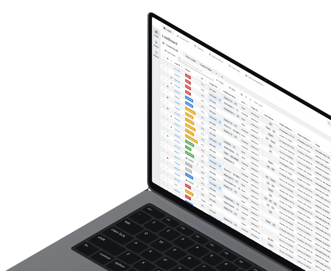
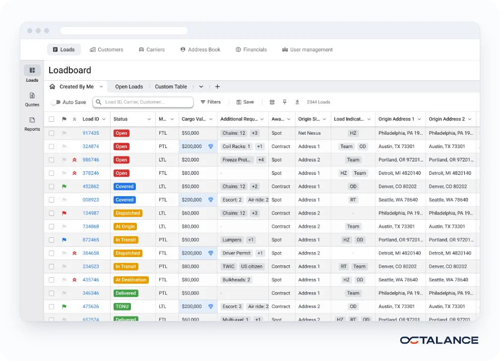
Our client's transportation management system has 10 to 15 modules, among them the load board, full and less-than-truckload, quotes, finance, user and customer management and an address book. It connects to freight tracking and load board services. The interface had too many controls and asked for data that didn't matter at the first step. Moving between modules was hard.
An approved concept, then the design system
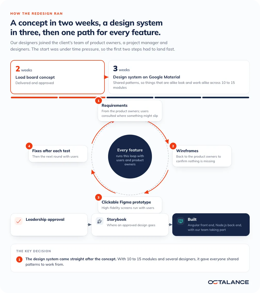
Our design team worked inside the client's team, beside its product owners. Under time pressure, we delivered a load board concept in 2 weeks, and it was approved. A design system on Google Material followed in 3 weeks, so the other modules had shared patterns to start from. Screens and clickable prototypes live in Figma. Storybook is where an approved design goes, and where developers pick it up.
From prototype to a built system
The project went from the prototype to full implementation. The system runs on Azure, and our team took part in its build, with Angular on the front end and Node.js on the back end.
How the work was ordered
Design system first, screens after
The usual order is screens first, with a design system gathered from them once enough screens exist. We built ours straight after the load board concept, so the other modules were designed with it from the start.
Why it couldn't wait
With that many modules, several designers working on them at once and a product owner for each part of the application, every module would otherwise settle how a status looks and where an action sits in its own way. A load coordinator moving from quotes to the load board would meet a slightly different interface each time. With the design system in place, things that are alike look and work alike, wherever they appear.
One path for every feature
Each feature follows the same route. Requirements come from the product owners, and we talk to users when something might have slipped past them. Wireframes go back to the product owners to confirm nothing is missing. High-fidelity screens become clickable Figma prototypes, which we run with users and correct after each test. Leadership approves the result, and it goes into Storybook.
Inside the interface
One set of patterns from list to load
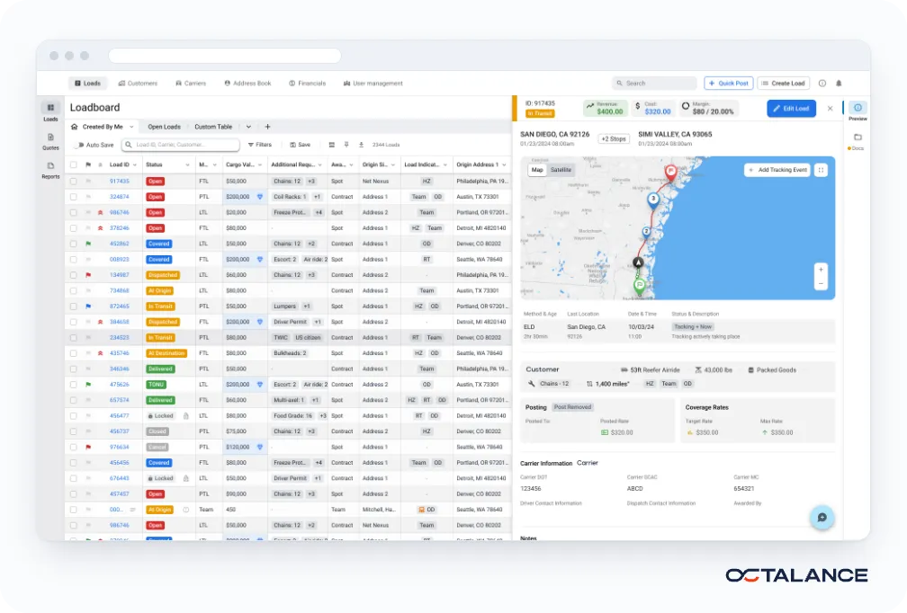
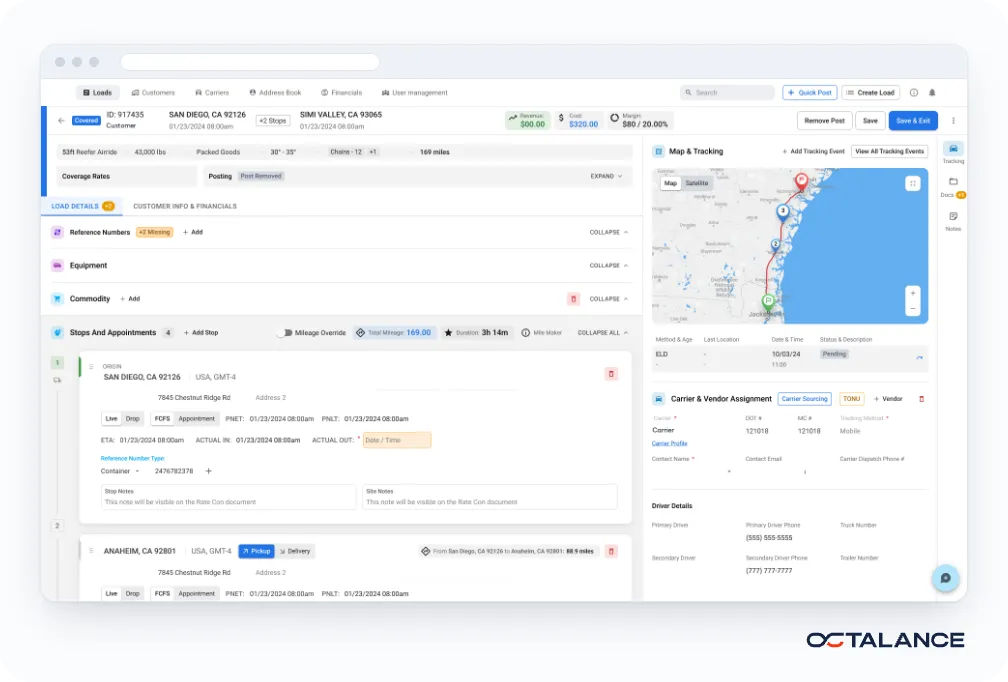
Open a load from the load board and a panel opens beside the list. It shows the load's status, its revenue, cost and margin, the route on a map with the latest tracking event, and the carrier's details.
The full load screen is made of the same parts. The status label, the revenue, cost and margin figures, the equipment and requirement chips and the map with its tracking table look as they do in the panel, now next to the stops, the appointments and the carrier assignment.
Someone who has read the panel can read the full screen without being shown how.
What changed in the built system
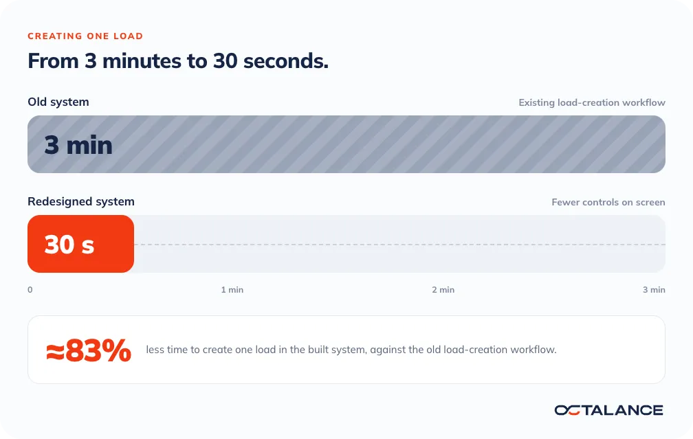
3 minutes in the old system, 30 seconds in the new one
The redesigned flow puts fewer controls on screen. The first step of creating a load now holds only the core fields, which are origin, destination, dates, equipment type and weight. Rates, extra services, reference numbers and the carrier choice moved to later steps.
Before the build, users tried creating a load in the clickable Figma prototype, and the screens were corrected after each test.
The project in numbers
30 s
To create a load in the new system
2 weeks
To an approved load board concept
3 weeks
To the design system's first version
More modules than consistent patterns?
Tell us which workflow slows your users down and what your system runs on. We reply to every enquiry within 24 hours.

Case studies