Fintech
Corporate payments platform: about 15% less time to prepare and submit payments
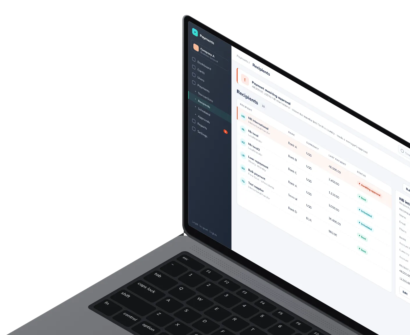
Finance teams pay a whole list of recipients from one Excel file, and a large transfer waits for management approval and confirmation
Custom software development
Who we worked with
Fintech company whose customers are businesses
The company's customers are businesses, and they come to the platform to pay. Whatever else the product does, a finance team judges it by how quickly a payment goes out and how rarely it goes to the wrong place.
What we did
Making payments the easy part
Payments were the weak spot
Businesses on our client's platform needed payments to go through faster, with shorter waits and fewer errors. The product team picked that flow as its main lever for raising Net Promoter Score. A customer will forgive a report screen it opens once a month, and it remembers every transfer that went wrong.
Frontend for two products, backend by other teams
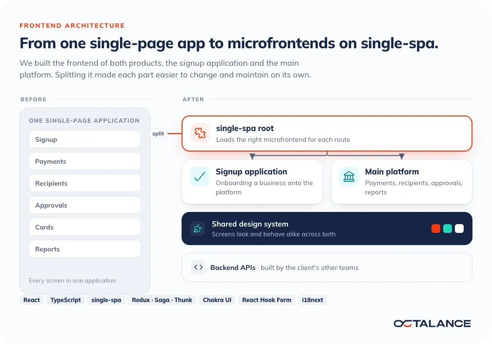
We took on the frontend of two products, the signup application and the main platform. The client's other teams built the backend. Our part was what a user sees and works in, every screen and flow from signing up to a payment going out. The frontend connects to QuickBooks, DocuSign and Zendesk, and to open banking and identity verification providers. The product tooling around it was LaunchDarkly, Amplitude and Hotjar.
Recipient pages and approval limits by country
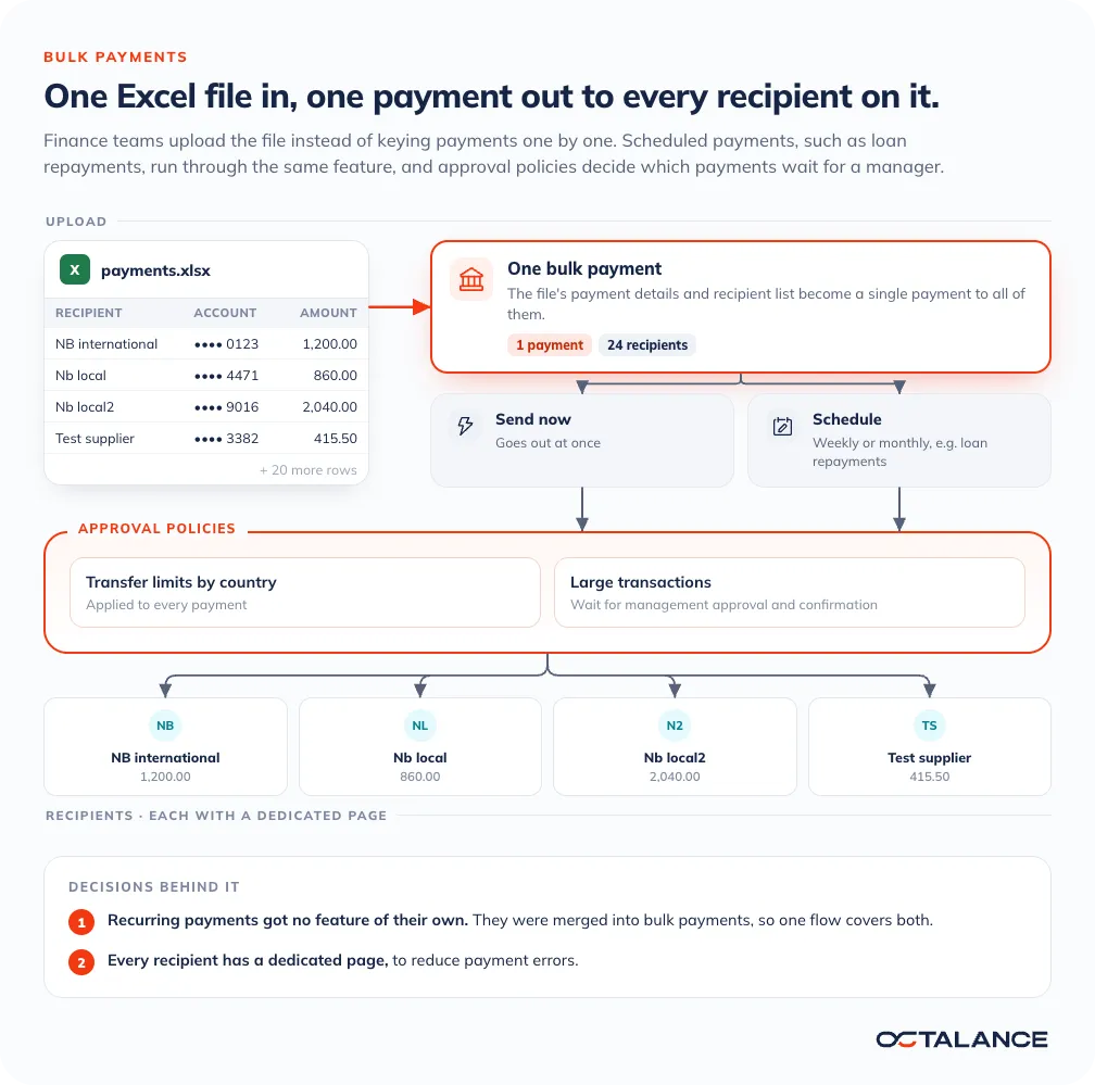
Each recipient got a dedicated page, to reduce payment errors. Approval policies apply transfer limits by country, and a large transaction waits for management approval and confirmation. Those rules give finance teams tighter control over financial risk, and expense approvals take less effort for our client's customers.
Bulk payments from one Excel file
For bulk payments, a user uploads an Excel file with payment details and a list of recipients and gets one payment to all of them. That cuts repetitive manual work for finance teams.
One design system across the platform
Our lead designer built a design system so the screens look and behave alike across the platform. Most of the time users save on preparing and submitting a payment came from this UI/UX work, the clearer flows, the more intuitive payment screens, the recipient pages and the design system itself.
How the frontend is built
Microfrontends, and one feature fewer
We moved the frontend from a single-page application to microfrontends on single-spa, for modularity and easier maintenance. In a single-page app, every part shares a codebase and a release, so a change to one is a change to all. Split into microfrontends under a single-spa root, each part can be built, tested and shipped on its own.
Microfrontends have a price. There is a root application to look after, and parts built separately can drift apart in how they look and behave. Parts that ship separately still have to work together, and each sprint had its own test plan, with API, UI, regression, smoke and exploratory testing.
Recurring payments merged into bulk payments
A smaller call followed. Recurring payments did not get a feature of their own and were merged into bulk payments. The bulk feature runs scheduled payments such as loan repayments, and a recurring payment is a schedule that repeats. A separate recurring feature means one more set of screens to learn and test.
Tech stack
Frontend stack and the services it connects to
React
TypeScript
single-spa
Redux with Saga and Thunk
Chakra UI
React Hook Form
Yup
react-table
nivo
Google Charts
Socket.IO client
i18next
QuickBooks
DocuSign
Zendesk
The project in numbers
~15%
Less time to prepare and submit payments
~2.5 years
Frontend work on two products
10
Frontend, QA and UI/UX specialists
Payments slower than your customers would like?
Tell us which payment flow your customers struggle with and who owns the backend. We reply to every inquiry within 24 hours.

Case studies